Iconify Updates 2023
Iconify Tools version 4.0.0
Iconify Tools version 4.0.0 has been released.
This is a breaking change, see below.
Changes
What has changed?
- Parallel fetching for importing icons from Figma. This is a massive improvement, can reduce import time by 5 times!
- Built in fetch was replaced with axios, which is faster, and you can configure proxy server.
- Resolved problem of huge call stack when working with large icons. This required a breaking change, see below.
Breaking changes
Some functions used to be asynchronous, when it was unnecessary.
To allow using Iconify Tools in synchronous environments, such as configuration files for Tailwind CSS plugins, one of the previous versions of Iconify Tools introduced synchronous variations of async functions. This has caused issues with big call stack when working with huge icons (500kb+ icons... yes, they exist...).
Version 4.0.0 makes the following functions synchronous only:
- validateColors() - checks palette in SVG (used to check colors in icon).
- parseColors() - parses palette in SVG (used to change colors).
- parseSVGStyle() - finds inline style in SVG, parses it, calls callback for each entry. Very basic parser, cannot handle advanced CSS.
- cleanupGlobalStyle() - finds <style> in icon, applies it to elements. Very basic parser, cannot handle advanced CSS.
- parseSVG() - parses SVG, calls a callback for each element. This is used internally by many functions that parse icon.
- deOptimisePaths() - removes some path optimisations that are not supported by old software.
The following functions were removed as they are no longer needed:
- validateColorsSync() - use validateColors().
- parseColorsSync() - use parseColors().
- parseSVGStyleSync() - use parseSVGStyle().
- parseSVGSync() - use parseSVG().
Cheerio types
Old version used to rely on @types/cheerio. This version uses cheerio's built in typescript files.
This is a breaking change because if you are using @types/cheerio in your project, you might run into TypeScript errors when using Iconify Tools. Solution is not to use @types/cheerio, recent versions of cheerio provide types.
New entries
New properties:
- axiosConfig - property to configure axios. Import it from @iconify/tools/lib/download/api, value contains options for axios calls, so, for example, to configure proxy set proxy property.
New methods in classes:
- toPrettyString() method in SVG instance. It generates formatted string.
New icon sets website preview
Early preview of new icon sets website is available at preview.iconify.design!
This is a completely new, rebuilt icon sets website, powered by Nuxt.
Early preview supports browsing and searching icons.
Main new features:
- Dynamic scrollable pagination. When browsing icons, the number of icons shown per page depends on your browser window. You can also scroll icons instead of using pagination.
- Advanced filters (click arrow button near filters in the top right corner). You can filter icon sets by grid, license and palette.
- Icon customisations. You can change colors, opacity of elements that have opacity, icon size. More options will be available later.
- Better code samples. While the old version focused on usage with Iconify icon components, the new version's main focus other methods of using icons: SVG, CSS. Code for icon components will be available too.
What is the purpose?
Rewrite's main purpose is to create reusable code base.
The same code base can be later used to create various plugins for design software, web platforms and applications.
State
Currently, this is just a preview.
This is not a full Nuxt app yet, all components are currently client side only.
You can follow updates here, on X/Twitter and Mastodon.
Iconify for Tailwind update
A new version of Iconify for Tailwind has been published.
Big change is the option to scale icons and the ability to completely remove icon dimensions.
By setting option scale to 0, you can remove default dimensions and use custom icon size:
addDynamicIconSelectors({
    scale: 0
});<span class="h-6 w-6 icon-[mdi-light--forum]"></span>See Iconify plugin documentation.
New milestone
Iconify has reached a new milestone: over 200k open source icons!
Support for require-trusted-types-for script policy
Several icon components have been updated:
- Iconify Icon web component
- SVG framework
- Iconify for React
New versions of packages work in environments with strict content security policy "require-trusted-types-for 'script';".
Iconify icon components rely on innerHTML to render SVG instead of doing unnecessary complex parsing of HTML.
But it is not needed. All icons in Iconify ecosystem pass very strict validation. Icons that contain scripts, event listeners, external resources, raster images and fonts are not allowed. All unknown tags and attributes are removed.
About require-trusted-types-for security policy
Security policy mentioned above requires libraries to clean up HTML before assigning it to innerHTML property of a DOM element.
To add that policy to your document, all you have to do is add the following code to page header:
<meta
  http-equiv="Content-Security-Policy"
  content="require-trusted-types-for 'script';"
 />
However, be aware that policy does not provide any actual security and is pretty much useless!
The process of cleaning up HTML is not regulated in any way, it is up to a library to decide how to clean up HTML.
This means libraries can just emulate clean up without doing any actual clean up.
Your website security should not rely on such useless "security" policies.
Iconify Tools 3.0
Iconify Tools version 3.0 is now available.
Changes:
- Several functions are no longer asynchronous: cleanupSVG(), runSVGO().
- New synchronous versions of many functions are available, including importDirectory().
- Option to keep titles in imported icons.
The main purpose of these changes is to allow using Iconify Tools to import and parse icons in environments where async operations are not supported, such as configuration files of various tools.
Icon search improvements
Icon search engine in Iconify API has been massively improved.
The new version shows results relevant to the search query first, making it easier to find icons you want.
Comparison: 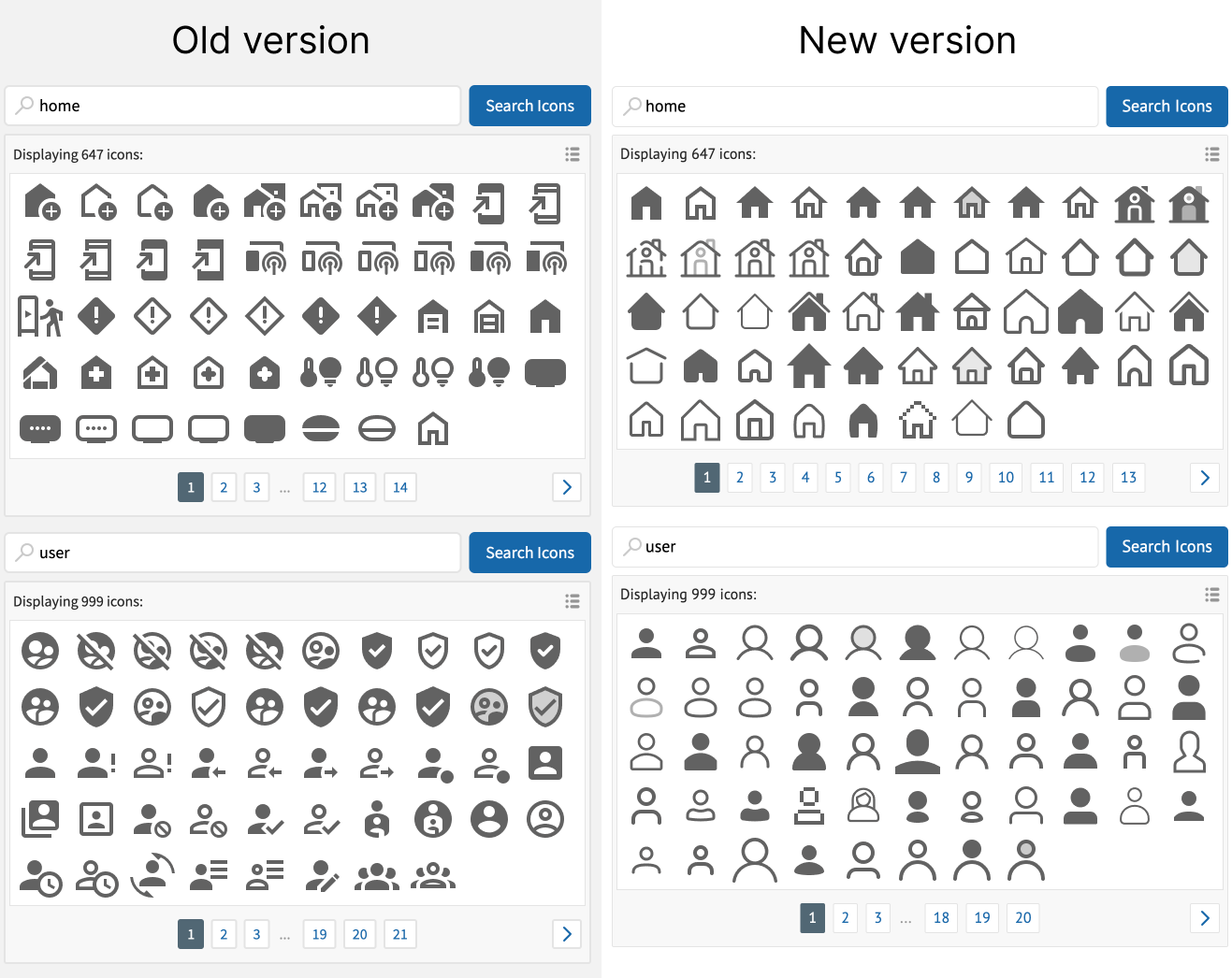
New search is automatically available for anyone using API, so it is available at Iconify website, plugins for Figma/Sketch and Icones.
New Iconify website
Welcome to the new Iconify website!
It has been rewritten from ground up, powered by Vitepress.
New website includes:
- Content of old website (basic pages, news and so on).
- Documentation, which is now searchable.
Website is now open source, you can edit or suggest edits on GitHub repository.
P.S. Vitepress is awesome!
New Iconify documentation
Iconify documentation has been restructured and many parts have been rewritten.
New documentation focuses on developer experience, trying to help developers find the correct tools from Iconify ecosystem.
See new improved Iconify documentation.
Custom CSS in the Iconify Icon web component
Iconify Icon web component has been updated.
New version includes function to append custom CSS to icons: appendCustomStyle().
Function can be imported from:
- iconify-icon package.
- As static method from web component constructor.
- As method from any <iconify-icon> element instance.
There are several limitations:
- It affects all instances of <iconify-icon> rendered after function is called.
- It does not affect instances created before function call.
- You cannot add CSS only for one icon yet.
These limitations will be removed in future versions.
Example
import { appendCustomStyle } from 'iconify-icon';

appendCustomStyle('svg [stroke-width="2"] { stroke-width: 1.5; }');
This will change stroke-width from 2 to 1.5 in all icons, rendered after that function call.
SVG without width and height with Iconify components
Iconify icon components have been updated.
New version includes ability to remove width and height properties from generated <svg>. Sometimes this is needed if you are using CSS to resize icon.
To remove width or height, set it to one of these values: "unset", "undefined", "none".
Example
Example usage in @iconify/vue component:
<Icon icon="mdi:home" height="unset" />
This will remove both width and height from rendered <svg> element.
Removing one attribute only
If you want to remove only one attribute, for example, width, you need to set value for height:
<Icon icon="mdi:home" width="unset" height="1em" />
This will remove only width attribute.
Web component
This function is not available in iconify-icon web component because it won't work as expected.
Iconify for Tailwind CSS
Iconify plugin for Tailwind CSS is available.
Iconify plugin is in early development stage, but already fully functional.
It creates CSS for icons, using icons as background and mask images. This allows you to use icons without any components, without inlining SVG.
See Iconify for Tailwind package for details.
HTML
Example usage in HTML:
<span class="icon--mdi-light icon--mdi-light--account"></span>
<span class="icon--fluent-emoji icon--fluent-emoji--megaphone"></span>
Generate CSS for icons with Iconify API
Iconify API now can dynamically generate CSS for icons.
All you have to do is link to /{prefix}.css?icons=icon-names on API, where "{prefix}" is icon set prefix and "icon-names" is comma separated list of icon names.
This allows you to use icons without any components, without inlining SVG.
Monotone icons
The best part is, it works with monotone icons!
Monotone icons are rendered with color, set to currentColor, just like icon fonts or inline SVG! How is it done? By using icon as mask image with background color, set to currentColor.
See Iconify API documentation for examples.
Example
This example shows icons with hardcoded palette from Noto Emoji icon set.
Stylesheet link: https://api.iconify.design/noto.css?icons=1st-place-medal,2nd-place-medal.
It generates this stylesheet:
.icon--noto {
    display: inline-block;
    width: 1em;
    height: 1em;
    background: no-repeat center / 100%;
 }

.icon--noto--1st-place-medal {
    background-image: url("data:image/svg+xml,%3Csvg xmlns='http://www.w3.org/2000/svg' viewBox='0 0 128 128' width='128' height='128'%3E%3Cpath fill='%23176CC7' d='M69.09 4.24c-1.08.96-9.48 17.63-9.48 17.63l-6.25 25.21l24.32-2.23S97.91 7.23 98.32 6.36c.73-1.58 1.12-2.23-1.67-2.23c-2.79-.01-26.55-.79-27.56.11z'/%3E%3Cpath fill='%23FCC417' d='M81.68 43.29c-1.21-.65-36.85-1.21-37.69 0c-.76 1.1-.65 6.13-.28 6.78c.37.65 12.35 6.22 12.35 6.22l-.01 2.03s.66 1.59 7.34 1.59s7.37-1.35 7.37-1.35l.06-2.05s10.49-5.24 11.04-5.7c.56-.47 1.03-6.87-.18-7.52zM70.7 51.62s-.03-1.4-.72-1.75c-.69-.35-11.8-.29-12.74-.24c-.94.05-.94 1.73-.94 1.73l-7.6-3.7v-.74l28.3.2l.05.84l-6.35 3.66z'/%3E%3Cpath fill='%23FDFFFF' d='M59.26 51.17c-.94 0-1.48.98-1.48 2.67c0 1.58.54 2.91 1.73 2.81c.98-.08 1.32-1.58 1.23-2.91c-.09-1.58-.29-2.57-1.48-2.57z'/%3E%3Cpath fill='%23FCC417' d='M28.98 90.72c0 23.96 21.66 34.63 36.06 34.12c15.88-.57 34.9-12.95 33.75-35.81C97.7 67.37 79.48 57.1 63.7 57.21c-18.34.13-34.72 12.58-34.72 33.51z'/%3E%3Cpath fill='%23FA912C' d='M64.53 120.67c-.25 0-.51 0-.76-.01c-7.5-.25-14.91-3.41-20.33-8.66c-5.8-5.62-8.98-13.22-8.94-21.39c.09-19.95 17.53-29.2 29.36-29.2h.1c16.03.07 29.19 12.53 29.56 29.42c.16 7.52-2.92 15.41-8.96 21.35c-5.64 5.53-13.12 8.49-20.03 8.49zm-.69-55.94c-10.61 0-26.3 8.68-26.34 25.88c-.03 12.86 9.93 26.08 26.52 26.64c6.32.2 12.83-2.22 18.09-7.39c5.46-5.37 8.53-12.29 8.42-18.99c-.24-14.53-12.12-26.09-26.54-26.15c-.04 0-.12.01-.15.01z'/%3E%3Cpath fill='%23FEFFFA' d='M57.82 60.61c-.69-.95-8.51-.77-15.9 6.45c-7.13 6.97-7.9 13.54-6.53 13.92c1.55.43 3.44-6.53 9.97-12.38c6-5.36 13.84-6.1 12.46-7.99zm30.25 25.87c-2.41.34.09 7.56-5.5 15.64c-4.85 7.01-10.35 9.55-9.71 11.09c.86 2.06 9.67-3.07 13.75-11.43c3.7-7.57 3.26-15.56 1.46-15.3z'/%3E%3Cpath fill='%23FA912C' d='M55.85 77.02c-.52.77-.05 7.52.26 7.82c.6.6 5.16-1.55 5.16-1.55l-.17 18.05s-3.35-.04-3.7.09c-.69.26-.6 7.22-.09 7.56s14.18.52 14.7-.17c.52-.69.39-6.78.15-7.06c-.43-.52-3.7-.31-3.7-.31s.28-26.58.19-27.43s-1.03-1.38-2.15-1.12s-10.32 3.62-10.65 4.12z'/%3E%3Cpath fill='%232E9DF4' d='M25.51 3.72c-.63.58 23.46 43.48 23.46 43.48s4.04.52 13.06.6s13.49-.52 13.49-.52S56.79 4.15 55.67 3.72c-.55-.22-7.97-.3-15.22-.38c-7.26-.09-14.34-.18-14.94.38z'/%3E%3C/svg%3E");
 }

.icon--noto--2nd-place-medal {
    background-image: url("data:image/svg+xml,%3Csvg xmlns='http://www.w3.org/2000/svg' viewBox='0 0 128 128' width='128' height='128'%3E%3Cpath fill='%23176CC7' d='M69.09 4.24c-1.08.96-9.48 17.63-9.48 17.63l-6.25 25.21l24.32-2.23S97.91 7.23 98.32 6.36c.73-1.58 1.12-2.23-1.67-2.23c-2.79-.01-26.55-.79-27.56.11z'/%3E%3Cpath fill='%23CECDD2' d='M81.68 43.29c-1.21-.65-36.85-1.21-37.69 0c-.76 1.1-.33 6.87-.04 7.56c.52 1.2 12.03 6.43 12.03 6.43l-.22 2.38s.94.24 7.63.24s8.01-.34 8.01-.34l.02-2.15s10.36-5.04 10.88-5.74c.44-.58.59-7.73-.62-8.38zm-10.61 9.12s.33-1.47-.36-1.81c-.69-.35-12.53-.19-13.47-.14c-.94.05-.94 1.73-.94 1.73l-7.6-4.53v-.74l28.3.2l.05.84l-5.98 4.45z'/%3E%3Cpath fill='%23FDFFFF' d='M59.26 51.17c-.94 0-1.48.98-1.48 2.67c0 1.58.54 2.91 1.73 2.81c.98-.08 1.32-1.58 1.23-2.91c-.09-1.58-.29-2.57-1.48-2.57z'/%3E%3Cpath fill='%23CECDD2' d='M28.97 91.89c0 23.96 22.05 34.13 36.46 33.7c16.79-.5 34.51-13.24 33.36-36.1C97.7 67.83 79.33 58.2 63.55 58.31c-18.34.14-34.58 12.65-34.58 33.58z'/%3E%3Cpath fill='%239B9B9D' d='M64.53 121.13c-.25 0-.51 0-.76-.01c-7.5-.25-14.91-3.41-20.33-8.66c-5.8-5.62-8.98-13.22-8.94-21.39c.09-19.95 17.53-29.2 29.36-29.2h.1c16.03.07 29.19 12.53 29.56 29.42c.16 7.52-2.92 15.41-8.96 21.35c-5.64 5.53-13.12 8.49-20.03 8.49zm-.69-55.94c-10.61 0-26.3 8.68-26.34 25.88c-.03 12.86 9.93 26.08 26.52 26.64c6.32.2 12.83-2.22 18.09-7.39c5.46-5.37 8.53-12.29 8.42-18.99c-.26-14.53-12.14-26.09-26.56-26.16c-.02 0-.1.02-.13.02z'/%3E%3Cpath fill='%23FEFFFA' d='M58.09 61.47c-.69-.95-7.76-.68-15.37 5.87c-7.56 6.51-8.69 13.71-7.33 14.09c1.55.43 3.44-6.53 9.97-12.38c6-5.35 14.1-5.69 12.73-7.58zm29.79 26.25c-2.41.34.09 7.56-5.5 15.64c-4.85 7.01-10.35 9.55-9.71 11.09c.86 2.06 9.67-3.07 13.75-11.43c3.69-7.56 3.25-15.55 1.46-15.3z'/%3E%3Cpath fill='%232E9DF4' d='M25.51 3.72c-.63.58 23.46 43.48 23.46 43.48s4.04.52 13.06.6s13.49-.52 13.49-.52S56.79 4.15 55.67 3.72c-.55-.22-7.97-.3-15.22-.38c-7.26-.09-14.34-.18-14.94.38z'/%3E%3Cpath fill='%239B9B9D' d='M56.85 86.35c1.04.01 1.97-1.4 2.83-2.26c1.83-1.84 3.75-3.3 5.94-1.32C71 87.66 60.2 92.62 56.1 99.4c-3.06 5.06-3.68 8.95-2.83 9.99s21.54.99 21.82.47c.28-.52.57-7.45.09-7.78s-10.65-.14-10.65-.14s.85-1.98 4.34-5c3.83-3.31 6.9-7.86 6.08-13.24c-1.7-11.12-12.9-11.53-17.75-7.66c-4.73 3.77-3.71 10.27-.35 10.31z'/%3E%3C/svg%3E");
 }
that you can use in HTML like this:
<span class="icon--noto icon--noto--1st-place-medal"></span>
<span class="icon--noto icon--noto--2nd-place-medal-medal"></span>
API query can be customised. See Iconify API documentation for more examples and parameters.
Monotone example
Stylesheet link: https://api.iconify.design/mdi-light.css?icons=account,account-alert,home.
It generates this stylesheet:
.icon--mdi-light {
    display: inline-block;
    width: 1em;
    height: 1em;
    background-color: currentColor;
    -webkit-mask: no-repeat center / 100%;
    mask: no-repeat center / 100%;
    -webkit-mask-image: var(--svg);
    mask-image: var(--svg);
 }

.icon--mdi-light--account {
    --svg: url("data:image/svg+xml,%3Csvg xmlns='http://www.w3.org/2000/svg' viewBox='0 0 24 24' width='24' height='24'%3E%3Cpath fill='black' d='M11.5 14c4.14 0 7.5 1.57 7.5 3.5V20H4v-2.5c0-1.93 3.36-3.5 7.5-3.5m6.5 3.5c0-1.38-2.91-2.5-6.5-2.5S5 16.12 5 17.5V19h13v-1.5M11.5 5A3.5 3.5 0 0 1 15 8.5a3.5 3.5 0 0 1-3.5 3.5A3.5 3.5 0 0 1 8 8.5A3.5 3.5 0 0 1 11.5 5m0 1A2.5 2.5 0 0 0 9 8.5a2.5 2.5 0 0 0 2.5 2.5A2.5 2.5 0 0 0 14 8.5A2.5 2.5 0 0 0 11.5 6Z'/%3E%3C/svg%3E");
 }

.icon--mdi-light--account-alert {
    --svg: url("data:image/svg+xml,%3Csvg xmlns='http://www.w3.org/2000/svg' viewBox='0 0 24 24' width='24' height='24'%3E%3Cpath fill='black' d='M10.5 14c4.14 0 7.5 1.57 7.5 3.5V20H3v-2.5c0-1.93 3.36-3.5 7.5-3.5m6.5 3.5c0-1.38-2.91-2.5-6.5-2.5S4 16.12 4 17.5V19h13v-1.5M10.5 5A3.5 3.5 0 0 1 14 8.5a3.5 3.5 0 0 1-3.5 3.5A3.5 3.5 0 0 1 7 8.5A3.5 3.5 0 0 1 10.5 5m0 1A2.5 2.5 0 0 0 8 8.5a2.5 2.5 0 0 0 2.5 2.5A2.5 2.5 0 0 0 13 8.5A2.5 2.5 0 0 0 10.5 6M20 16v-1h1v1h-1m0-3V7h1v6h-1Z'/%3E%3C/svg%3E");
 }

.icon--mdi-light--home {
    --svg: url("data:image/svg+xml,%3Csvg xmlns='http://www.w3.org/2000/svg' viewBox='0 0 24 24' width='24' height='24'%3E%3Cpath fill='black' d='m16 8.41l-4.5-4.5L4.41 11H6v8h3v-6h5v6h3v-8h1.59L17 9.41V6h-1v2.41M2 12l9.5-9.5L15 6V5h3v4l3 3h-3v8h-5v-6h-3v6H5v-8H2Z'/%3E%3C/svg%3E");
 }
that you can use in HTML like this:
<span class="icon--mdi-light icon--mdi-light--account"></span>
<span class="icon--mdi-light icon--mdi-light--account-alert"></span>
<span class="icon--mdi-light icon--mdi-light--home"></span>
Parameters
API query can be customised.
You can change selectors, set hardcoded color for monotone icons, and download generated stylesheet.
See Iconify API documentation for more examples and parameters.
Generate CSS for icons with Iconify Utils
New functions for generating stylesheet for icons are available in Iconify Utils:
- getIconCSS() to generate CSS for one icon.
- getIconsCSS() to generate CSS for multiple icons.
What do these functions generate? A stylesheet, which renders icons as background or mask images.
To use icon in your project, all you have to do is generate stylesheet, then add basic element, such as <span> to render icon:
<span class="icon--tabler icon--tabler--code"></span>Examples
Example of stylesheet generated for one icon with hardcoded palette using getIconCSS():
.emoji--annoyed-face-with-tongue {
    display: inline-block;
    width: 1em;
    height: 1em;
    background: no-repeat center / 100%;
    background-image: url("data:image/svg+xml,%3Csvg xmlns='http://www.w3.org/2000/svg' viewBox='0 0 72 72' width='72' height='72'%3E%3Cpath fill='%23fcea2b' d='M36.2 13.3A22.8 22.8 0 1 0 59 36.1a22.79 22.79 0 0 0-22.8-22.8Z'/%3E%3Cpath fill='%23ea5a47' d='M40.5 41.7c-1.8 4.3-2 6-5.5 8.9c-5.6 4.8-7.6-4.1-5.7-8.9Z'/%3E%3Cg fill='none' stroke='%23000'%3E%3Ccircle cx='36' cy='36' r='23' stroke-miterlimit='10' stroke-width='2'/%3E%3Cpath stroke-miterlimit='10' stroke-width='2' d='M40.5 42.25c-1.8 5.8-6 10.7-9 9.8s-4-4.9-2.3-10.8'/%3E%3Cpath stroke-linecap='round' stroke-linejoin='round' stroke-width='2.001' d='M46.8 39.7a4 4 0 0 0 0 6m-23-3c2.3-.8 6.8-1 10.5-1s8.3.2 10.5 1'/%3E%3Cpath stroke-linecap='round' stroke-miterlimit='10' stroke-width='2' d='M48.9 32.4a4.7 4.7 0 0 0-8.6 0m-8.6 0a4.7 4.7 0 0 0-8.6 0'/%3E%3C/g%3E%3C/svg%3E");
 }
Example of stylesheet generated for multiple monotone icons from Tabler Icons using getIconsCSS():
/* Common code is combined in one class that should be added to each icon */
.icon--tabler {
    display: inline-block;
    width: 1em;
    height: 1em;
    background-color: currentColor;
    -webkit-mask: no-repeat center / 100%;
    mask: no-repeat center / 100%;
    -webkit-mask-image: var(--svg);
    mask-image: var(--svg);
 }

/* SVG for each icon. Class name should be combined with common class name used above */
.icon--tabler--code {
    --svg: url("data:image/svg+xml,%3Csvg xmlns='http://www.w3.org/2000/svg' viewBox='0 0 24 24' width='24' height='24'%3E%3Cpath fill='none' stroke='%23000' stroke-linecap='round' stroke-linejoin='round' stroke-width='2' d='m7 8l-4 4l4 4m10-8l4 4l-4 4M14 4l-4 16'/%3E%3C/svg%3E");
 }

.icon--tabler--crystal-ball {
    --svg: url("data:image/svg+xml,%3Csvg xmlns='http://www.w3.org/2000/svg' viewBox='0 0 24 24' width='24' height='24'%3E%3Cg fill='none' stroke='%23000' stroke-linecap='round' stroke-linejoin='round' stroke-width='2'%3E%3Cpath d='M6.73 17.018a8 8 0 1 1 10.54 0'/%3E%3Cpath d='M5 19a2 2 0 0 0 2 2h10a2 2 0 1 0 0-4H7a2 2 0 0 0-2 2zm6-12a3 3 0 0 0-3 3'/%3E%3C/g%3E%3C/svg%3E");
 }
Background or mask
Generated code uses background or mask image for icons. What is the difference?
- Background image is used for icons with hardcoded palette.
- Mask image in combination with background color, set to currentColor is used for icons without palette. This combination renders icon with current text color, making it easy to change icon color by changing text color.
Advantages
Advantages of using stylesheet for icons instead of inline SVG:
- Can be used with any framework. No need for special components.
- No extra elements in DOM.
- Instant rendering of animated icons.
However, there are also disadvantages:
- Cannot target a specific element in icon, which makes things like changing stroke-width impossible. It has to be done at build time when providing icon data to getIconCSS() or getIconCSS().
- Cannot mix currentColor and hardcoded palette in icon. This is not an issue when using Iconify icon sets, as such icons are not allowed, but it can be an issue when using custom icons.
Documentation
See documentation for more details:
- getIconCSS() documentation.
- getIconsCSS() documentation.