Iconify Updates 2025
Update for multiple packages
New minor versions of several Iconify packages have been published:
as well as yesterday's release of new major version of Iconify Tools.
Goal of all those releases is the same: reduce number of dependencies. These releases in some cases reduced number of dependencies to less than half of what it used to be.
Today, when developers and NPM packages are becoming targets of malicious attacks, it is more important than ever to stop relying on unnecessary and outdated dependencies.
All packages behave the same as before, changes are only internal.
Iconify Tools update
New major version of Iconify Tools has been published.
Changes:
- Drops support for CommonJS.
- Reduces number of dependencies and size of dependencies.
- Uses new custom parser for XML.
CommonJS support
The biggest change is removal of CommonJS support.
Many dependencies no longer support CommonJS, making it impossible to update those dependencies while providing CommonJS support. To keep everything up to date, new version also removes CommonJS support.
If for some reason you still need CommonJS, install version 4:
npm install @iconify/tools@cjs --saveNew XML parser
SVG is now parsed by custom parser, which is much smaller than old parser.
That massively reduces bundle size and number of dependencies.
Migration
There is nothing to do. Old code should work fine with new version.
Figma update
Iconify icon sets are updated from multiple sources, but mostly from Git repositories and Figma documents.
Unfortunately, updating from Figma documents is no longer possible.
Figma has introduced heavy rate limiting for API queries, making it impossible to retrieve documents with many SVGs from Figma API.
Affected icon sets
How does this affect Iconify?
This will affect updates of existing icon sets that are retrieved from Figma - those icon sets will no longer be maintained.
Iconify Tools removes axios
Usually only major updates are posted here, but this one can potentially be breaking for some users.
Iconify Tools package has been updated, which includes mostly just updates to dependencies and minor fixes, but there is one change that could be breaking: removal of axios as dependency.
If you need to use axios for some reason, you can set it with new setFetch() function:
import axios from "axios";
import { setFetch } from "@iconify/tools";

const fetchAxios = axios.create({
  adapter: "fetch",
 });

setFetch(fetchAxios);
Iconify Unplugin
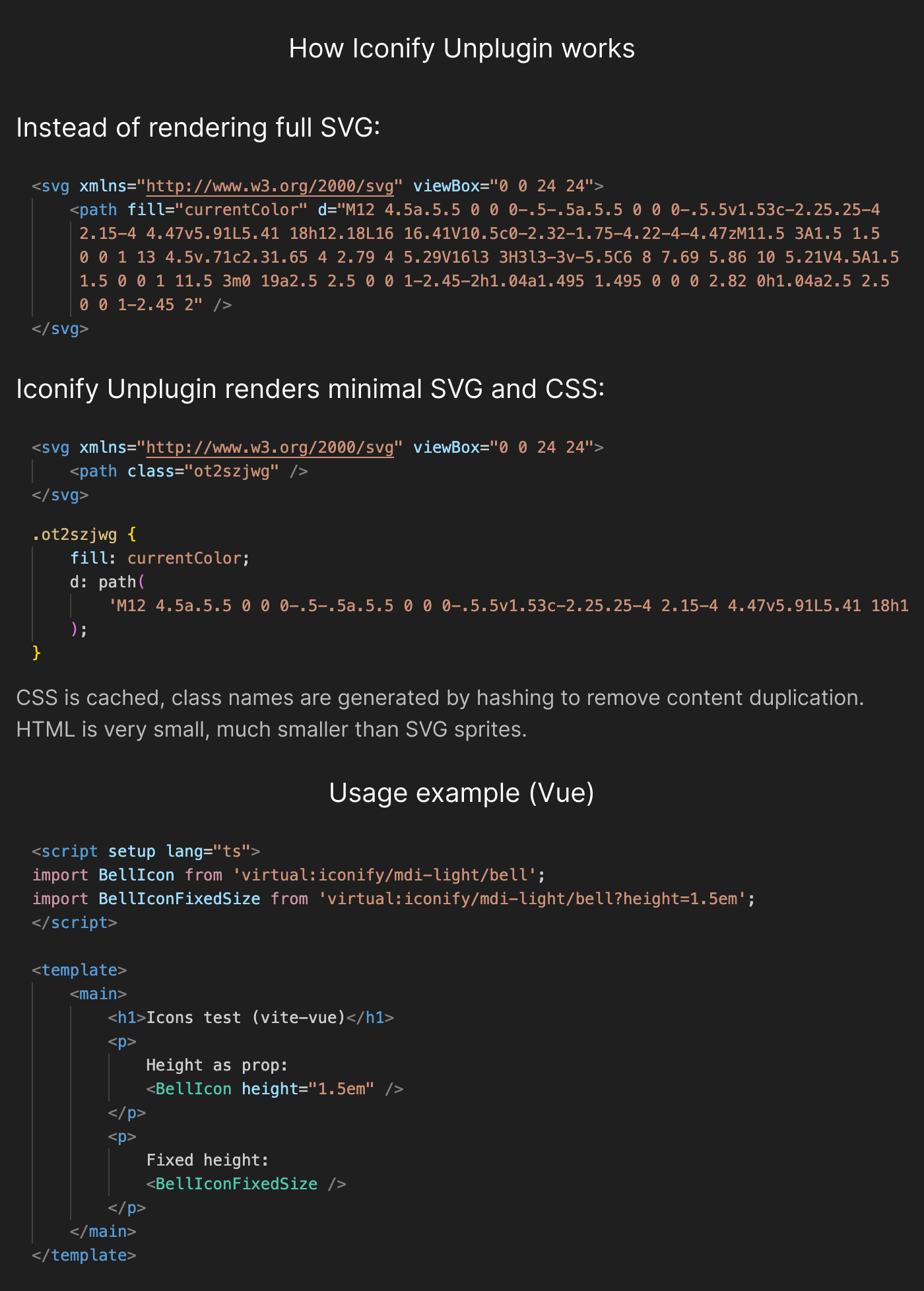
Announcing a new way of rendering icons: Iconify Unplugin.
What makes it different?
- Unlike other solutions, it splits icons in SVG + CSS. This massively reduces HTML size, while still rendering full SVG.
- Unlike icons on demand, Unplugin Iconify generates icons at build stage, so icons are bundled and rendered instantly.
- Instead of pre-built icon components, components are generated on demand, allowing you to customise components.
- Supports multiple frameworks. Current it supports only Vue, Svelte, React and Preact. More will be added soon.
See GitHub repository.
Short graph of how it works:
Documentation is not ready yet, see readme file in GitHub repository.
If you have used Unplugin Icons package, which Iconify Unplugin is heavily inspired by, Unplugin Icons documentation might be useful. Usage is very similar.
Iconify for Tailwind CSS update
Iconify plugin for Tailwind 4 has been updated.
There are two changes:
- Plugin now supports custom icon sets.
- Fixed square option that was not working in dynamic selectors plugin.
See custom icons in Tailwind 4 documentation.
Update for Icon component for Svelte
New minor version of Iconify icon component for Svelte has been published.
This update fixes issue that triggered "effect_update_depth_exceeded" error in Svelte when using many icons (over 5k icons) on same page.
This also slightly changes component behavior. Now icon is rendered immediately, without waiting for component to mount, which might cause hydration warnings when using component with SvelteKit.
Additionally, ssr property has been removed because it is no longer used.
SVG + CSS components for Svelte
Following a set of Vue components, new easy to use icon components for Svelte have been published.
See SVG + CSS for Svelte for details.
Components use Svelte runes, Svelte version 5 is required.
There are over 200 icon component packages, one per icon set:
- @iconify-svelte/material-symbols for Material Symbols icons
- @iconify-svelte/solar for Solar icons
- @iconify-svelte/tabler for Tabler icons
... and so on.
To import an icon component, import default item from @iconify-svelte/prefix/icon where "prefix" is icon set prefix, "icon" is icon name.
Example:
import GithubIcon from "@iconify-svelte/ri/github-line";then in Svelte template use:
<GithubIcon height="1em" />These packages will be automatically updated when Iconify icon sets are updated.
SVG + CSS components for Vue
New easy to use icon components for Vue have been published.
See SVG + CSS for Vue for details.
There are over 200 icon component packages, one per icon set:
- @iconify-vue/material-symbols for Material Symbols icons
- @iconify-vue/solar for Solar icons
- @iconify-vue/tabler for Tabler icons
... and so on.
To import an icon component, import default item from @iconify-vue/prefix/icon where "prefix" is icon set prefix, "icon" is icon name.
Example:
import GithubIcon from "@iconify-vue/ri/github-line";then in Vue template use:
<GithubIcon height="1em" />These packages will be automatically updated when Iconify icon sets are updated.
Fallback components for SVG + CSS
For most use cases, SVG + CSS is an optimal way of rendering icons.
However, currently the latest version of Safari browser does not support it.
That means a fallback is required to render icons as full SVG without CSS for Safari users.
Fallback components have been created for the following frameworks:
- Vue: @iconify/css-vue.
- Svelte: @iconify/css-svelte.
- React: @iconify/css-react.
For now, only Vue version is marked as stable because it has been fully tested in production.
React and Svelte components should be stable because they share code base with Vue component, but because icon components that rely on those components are not available yet, these two components have no real use yet and cannot be fully tested.
No more CommonJS support
New major versions of Iconify Utils have been published.
This release includes only one change: removal of CommonJS support.
More and more NPM packages remove CommonJS support. I tried to keep supporting both CJS and ESM for as long as possible, but some dependencies used by Iconify Utils package no longer support CommonJS, so it is time for a choice: keep outdated dependencies or remove CommonJS support.
In modern development there is no place for CommonJS. It is a relic of the past.
If your build process requires CommonJS support, I urge you to update your code.
If you can't update, you can still use version 2 of Iconify Utils. You can install old version using:
npm install @iconify/utils@cjs200 icon sets
Iconify has reached a new milestone: 200 open source icon sets!
Huge thanks to all developers that release open source icons and maintain them. Most developers don't realise how many amazing open source icon sets exist. You can find icons for almost anything.
Iconify icon components update
New major versions of all Iconify Icon components have been published.
Changes (applies to all components):
- Removed several previously deprecated functions.
Additional changes for Vue component:
- Component was rewritten using Vue's Composition API.
- New load event, fired when data for icon is loaded from API.
Additional changes for Svelte component:
- Component was rewriten using Svelte 5 runes syntax.
- Changed onLoad event, to onload callback to match new Svelte 5 syntax.
For more details, see migration guide, which explains every change and what you need to change in your code.
Iconify for Svelte update
Iconify icon component for Svelte has been rewritten with Svelte 5 runes.
Previous version used Svelte 4 syntax.
Version 5 of component can be installed using @next tag:
npm install --save @iconify/svelte@nextWhile Svelte 5 supports old syntax, it is better to update component to make it future proof.
Additionally, the following changes are included in this update:
- Previously deprecated functions disableCache() and enableCache() have been removed.
- Previously deprecated function iconExists() has been removed. Use iconLoaded() instead (functionality is identical... more on that later in upcoming release notes).
Iconify for Vue update
Iconify icon component for Vue has been rewritten with Vue's Composition API.
Previous version relied on Options API.
Version 5 of component can be installed using @next tag:
npm install --save @iconify/vue@nextIf you prefer to use Options API, you can still use version 4 of Iconify icon component.
Why Composition API?
Many Vue developers are moving away from Options API and now there is a new option to remove Options API support from Vue bundle: "__VUE_OPTIONS_API__".
If there is a component that relies on Options API, it means new option cannot be used.
For Iconify icon component it does not make any difference which API to use, there are no advantages in using either API, so switching to Composition API makes sense.
Additional changes
Additionally, new version includes the following breaking changes:
- Functions enableStorage and disableStorage have been removed. They were deprecated in previous version.
- Removed wildcard export, which caused a Node warning when building a Nuxt app with Nuxt Icon on Windows.
Iconify API update
Iconify API version 3.1.1 has been released.
This update includes a critical bug fix. If you are running an API instance, please do update it as soon as possible.
API is available on:
- GitHub - you can customise it before deploying.
- NPM - can be embedded in an app without running a full server.
- Docker - for quick deployment.
See API documentation.
Iconify plugin for Tailwind CSS 4
Iconify plugin for Tailwind CSS 4 is now available.
This plugin can be used with new @plugin directive in Tailwind CSS 4:
@plugin "@iconify/tailwind4";See plugin documentation for details.
Iconify components update
New minor versions of all Iconify icon components have been published.
This affects only components that load icon data on demand from Iconify API.
This update removes usage of localStorage for caching icons, making all components GDPR compliant.
Why was it removed?
Caching icons in storage was a very useful strategy in early days of project, when API was not stable and there were no offline solutions.
Today there are other solutions, like various CSS solutions and Unplugin Icons.
Iconify Icon components load icons from API should only be used when internet access is guaranteed. Those components should not be used for apps that can work offline. For offline usage, see links above to alternative solutions.
Additionally, all Iconify icon components have redundancies to load icons from a backup API in case main Iconify API host is unreachable. Therefore, additional layer of caching is no longer needed.
Code changes
Code that managed localStorage cache was not just disabled, it was removed.
This reduces package size for components by about 10%.
Functions enableStorage and disableStorage are still available to avoid breaking user's code, but they do not do anything. They will be removed in new major versions of components.