Iconify Updates 2024
New versions of Iconify icon components, utils and tools
Published new minor versions of the following packages:
- Iconify Utils.
- Iconify Tools.
- Iconify Icon web component and its wrappers.
- Iconify Icon components for Vue, React and Svelte.
- Iconify plugin for Tailwind CSS.
There are 2 changes:
- Icon naming requirements
- Custom icon loaders
Naming convention changes
The biggest change is in naming convention.
Until now, all components allowed only icon names that contained lower case letters, numbers and dash: [a-z0-9-].
Now those restrictions are removed. Any non-empty string is allowed.
Custom loaders
Icon components now support custom icon loaders, which you can define using one of these functions:
- setCustomIconLoader().
- setCustomIconsLoader().
What is it for?
- To load icons from custom sources instead of Iconify API.
- To customise icons.
It is currently used by new Nuxt Icon component to load custom icons in Nuxt apps.
See Iconify Icon component documentation.
Iconify plugin for Penpot
Iconify plugin for Penpot is now available
See Iconify plugin for Penpot documentation.
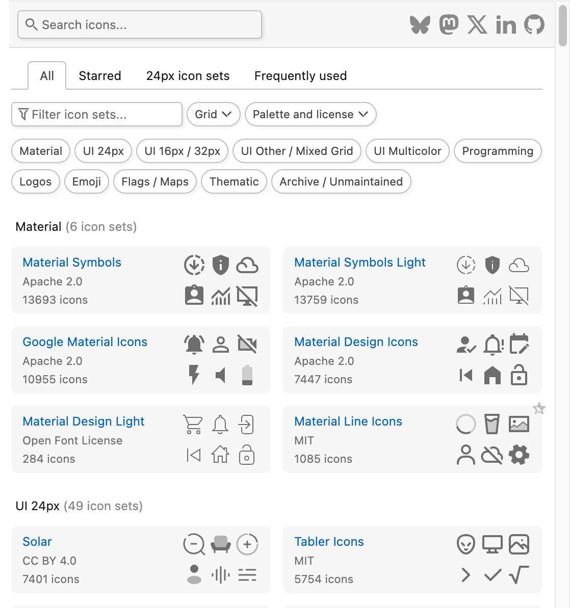
New website for browsing icons
After many months of hard work, Iconify icon sets website has been fully rebuilt.
New icon sets website is now live. Powered by Nuxt!
What is new?
- Cleaner UI, focused on developer experience. No more color overload.
- More samples shown for each icon set.
- Favorite icon sets, custom lists.
- Search function can search only currently visible icon sets: favorite icon sets, icon sets list or filtered icon sets.
- Better code samples for icons.
New logo
Old logo was a temporary solution. It was supposed to be replaced with a proper unique logo long time ago, but due to time constraints and lack of imagination (creating unique logos is VERY hard!), it took several years to come up with a new logo.
New logo is finally ready.
Over the years Iconify project have become a home for open source icons. Many developers and designers use Iconify daily in their workflow to find the best open source icons.
New logo represents a home icon, rendered as separate lines.
Figma plugin rewrite
New version of the Iconify plugin for Figma is now live!
You can install it from Iconify plugin page on Figma website.
It is a full rewrite, not a minor update. New UI used in plugin will also be used on new Iconify website very soon.
Main new features:
- Better UI and UX.
- Advanced filters for icon sets.
- Favorite icon sets and custom lists of icon sets.
- Detailed license information for each icon set, also shown for icons in search results.
- No more pagination when browsing icons.
- Quick import button.
- Support for color styles (only solid colors).
- More precise drag and drop.
Figma plugin preview
Iconify plugin for Figma has been redesigned.
However, it is not live yet. More testing is needed.
You can download and install plugin from GitHub repository.
Additionally, the previous version of plugin has been backed up in archive/v3-dist branch of repository, so you can use the old version after the new version goes live.
See plugin redesign page for more details and screenshots.
Iconify packages syntax update
Iconify packages @iconify-json/* use JSON files to store data.
Until today, JSON files were imported with older assert syntax:
import icons from './icons.json' assert { type: 'json' };Now all packages use new with syntax:
import icons from './icons.json' with { type: 'json' };All runtimes support the new syntax. For Node.js you need version 18 or newer.
If you are using Node version 16 or an older version, consider updating. Old import syntax has been deprecated by Node and will be removed, so using old syntax is not an option.
UnoCSS and Unplugin Icons update
Both UnoCSS and Unplugin Icons were updated.
While those libraries are not part of Iconify project, both libraries share the same icon loaders, which are included in Iconify Utils package.
This is quite a big update.
Changes:
- Fixed scale option. See below.
- cwd option now can be an array of paths, making it easy to search multiple node_modules directories in a monorepo.
- Added two parameters to customize callback, one of which is mutable icon data. This allows customising icon content.
Scaling
In older version, scale option was bugged for non-square icons:
- If the option was set, it caused width to be identical to height, rendering square icons.
- If the option was not set, it rendered icon with the correct aspect ratio.
While square icons might be useful for thin icons, for wide icons this caused parts of icons to be trimmed, which is clearly a bug.
In new version, scale option scales icon correctly, keeping icon's aspect ratio.
It also now plays nicely with customize option, applying scaling to customised icon sizes.
Customize
In older version, customize option was rather useless. It could be used to only rotate or flip an icon, and the user didn't even know which icon was customized because there was no context.
In new version, customize function has two new parameters:
- data, IconifyIcon with icon data.
- name, string with icon name in "prefix:name" format.
Icon name lets you know which icon you are customizing.
Icon data is a mutable object, you can change it to customise icon. You can change colors in icons that have hardcoded palette, opacity, timing for animations, add additional shapes and so on... You can also resize icon or add padding by messing with width, height, left and top properties.
See IconifyIcon type for icon data format.
Examples
Making all icons square:
presetIcons({
    customizations: {
        customize: (defaultCustomizations, data, name) => {
            // Make icon square
            const width = data.width ?? 16;
            const height = data.height ?? 16;
            if (height > width) {
              // Set width to match height
              data.width = height;
              // Center icon horizontally by changing viewBox left position
              data.left = (data.left ?? 0) - (height - width) / 2;
            }

            return defaultCustomizations
        },
    }
 })
Changing color:
presetIcons({
    customizations: {
        customize: (defaultCustomizations, data, name) => {
            if (name === 'twemoji:blue-square') {
                // Turn blue square into red square
                data.body = data.body.replaceAll('#55ACEE', '#e83933')
            }

            return defaultCustomizations
        },
    }
 })
If something is not working, don't forget that you can always console.log(data) to see icon data.
Iconify for Tailwind CSS update
Iconify plugin for Tailwind CSS received a small update:
- Plugin addIconSelectors() can render non-square icons.
See addIconSelectors plugin size and color documentation.
Iconify for React 5.0.0
The new major version of the Iconify icon component for React has been released.
Changes:
- Rewritten using modern React hooks.
- Works with Next.js (as a client-only component).
- Package uses ES modules by default, though CommonJS is supported too.
- Added ssr property, similar to the recent Vue component update.
Iconify for Tailwind CSS major update
Iconify plugin for Tailwind CSS received a major update:
- Bundle has a new plugin: addIconSelectors().
- You can now customise all icons.
Customise option
New customise option allows you to change content of icons.
What is it for?
- You can change stroke-width in icons that use stroke.
- You can change colors in icons that use hardcoded palette, such as emojis.
- You can change animation duration in animated icons.
- You can change opacity of semi-transparent elements.
- You can add extra shapes to icons.
...and so on. You have full control over SVG content.
See customise option documentation.
New plugin
New addIconSelectors() replaces old addCleanIconSelectors() plugin, though old plugin is available too.
Usage examples:
<span class="iconify ph--alarm-duotone"></span>
<span class="iconify-color fluent-emoji-flat--alarm-clock"></span>
<span class="iconify carbon--edit-off"></span>
What are the advantages of the new plugin?
- Generates smallest possible CSS for icons.
- Cleaner icon names.
- You can use the same icon as mask or background image.
- It can work with custom icon sets.
See new plugin for Tailwind CSS documentation.
Iconify for React rewrite
Iconify icon component for React has been rewritten.
New version is published as "5.0.0-beta.1". You can install it by installing @iconify/react@next.
Changes:
- Rewritten using modern functional React. Old component still used classes.
- Fixed TypeScript errors.
- Added ssr property, similar to the recent Vue component update.
SSR prop
New property ssr, if enabled, will make icon render immediately, without flickering if icon data is available.
<Icon icon="mdi:home" ssr={true} />Why is it not enabled by default?
Rendering dynamically loaded content is tricky with SSR. When a page is hydrated, content rendered on server and client must match. To avoid issues, Iconify icon components do not render anything until the component is mounted, which happens after hydration is complete.
When to use it?
The new attribute will render icon immediately when data is available, regardless of mount state.
This should be used carefully with SSR (server side rendering, such as Next). Make sure icon data is available on server and client before rendering a component.
If you are not using SSR, it is safe to use attribute to force icon render faster because there is no hydration process. It will render icon immediately when icon data is available.
Or, to be completely safe, use Iconify Icon web component. It is safe to use with and without SSR.
Iconify API 3.1.0
Iconify API version 3.1.0 has been published on NPM and Docker.
It fixes a bug that prevented icons named "constructor" from being displayed correctly (forgot to use null constructor for object in one place in code).
Figma plugin preview
Preview of the new Iconify plugin for Figma is now fully functional.
All functions and pages are working properly.
You can download and install plugin from GitHub repository.
Additionally, the previous version of plugin has been backed up in archive/v3-dist branch of repository, so you can use the old version after the new version goes live.
Iconify for Vue 4.1.2
Iconify icon component for Vue has been updated.
Version 4.1.2 adds new boolean attribute: ssr.
If enabled, an icon will be rendered immediately, without flickering if icon data is available.
<Icon icon="mdi:home" :ssr="true" />
Why is it not enabled by default?
Rendering dynamically loaded content is tricky with SSR. When a page is hydrated, content rendered on server and client must match. To avoid issues, Iconify icon components do not render anything until the component is mounted, which happens after hydration is complete.
When to use it?
The new attribute will render icon immediately when data is available, regardless of mount state.
This should be used carefully with SSR (server side rendering, such as Nuxt). Make sure icon data is available on server and client before rendering a component.
If you are not using SSR, it is safe to use attribute to force icon render faster because there is no hydration process. It will render icon immediately when icon data is available.
Or, to be completely safe, use Iconify Icon web component. It is safe to use with and without SSR.
Figma plugin preview
Preview of the new Iconify plugin for Figma is available!
This is a complete rewrite, built with Vue.
Short list of new features:
- More compact UI, making it easier to use plugin on small screen.
- Advanced filters for icon sets, favorite icon sets, detailed license information.
- List of icons is now scrollable. You are no longer required to use pagination.
- More precise drag and drop.
- Better handling for icon dimensions. When replacing icon, new icon will be imported with same dimensions. New icons will be imported as small icons.
- Better handling of animated icons. Figma does not support animations, so animations are stripped correctly before importing icon.
You can download and install plugin from GitHub repository.
Iconify Icon 2.1.0
Iconify Icon web component version 2.1.0 has been published.
Iconify Icon web component uses IntersectionObserver to detect when icon is visible. If it is not visible, the icon is not rendered. Not rendering icons that are not visible improves page performance by a lot, especially when using animated icons.
New version adds noobserver attribute, which can be used to disable IntersectionObserver:
<iconify-icon icon="line-md:bell-alert-loop" noobserver></iconify-icon>Download icons as PNG
On Iconify icon sets website you can now download icons as PNG!
- You customise PNG size, default is 512x512.
- Animations are automatically removed from animated SVGs.
- You can download and/or copy to clipboard.
- Website shows sample PNG that you can drag/drop to other apps. It is scaled down in UI, but dropped as full size.
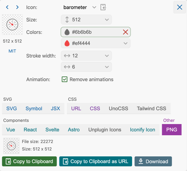
Customise icon stroke width and remove animations
Iconify icon sets website has been updated.
You can now:
- Change stroke width in icons that use stroke.
- Remove animations from animated SVGs.
Removing animations from SVGs is very helpful if you want to use icons in design tools. Currently, all design tools do not support animated SVGs, importing animated icon usually results in broken or empty icon.
By removing animation for design tool, you can use static icon in your design, but animated icon in HTML.
Quick demo:
Iconify Icon 2.0.0
Iconify Icon web component version 2.0.0 has been published.
See Iconify Icon 2.0.0 beta announcement that was published earlier for the list of changes.
Deprecation of old packages
Time has come to deprecate some old packages, which are no longer relevant:
These old icon components are no longer updated, their source code has been archived:
- Vue 2 (Vue 3 was released a long time ago, no point in supporting the old version)
- Ember (Ember framework is outdated)
- SVG Framework (the oldest of components, has been replaced by the IconifyIcon web component)
You can still use them in your old projects, but should consider updating to modern alternatives, such as web component.
Customise speed of animated SVGs
Iconify icon sets website has been updated.
You can now change the animation speed of animated SVGs.
It is not a full editor (yet), you can only multiply animation duration values to slow down animations or speed them up.
You can use it with any animated icon, such as icons from:
Quick demo:
Iconify Icon 2.0.0-beta.1
Iconify Icon web component version 2.0.0 beta 1 has been published.
This release offers massive improvements in SVG performance: it uses IntersectionObserver to check if icon is visible to the current visitor, rendering icon only when visible.
As a nice side effect, icons that have fade in animation start animating when it appears in viewport.
New version is used on this website and new Iconify icon sets website.
To install beta version, use @next tag:
npm install --save iconify-icon@nextNew "observe" property
You can change observer behavior by changing observe attribute.
By default, it is enabled. To disable it, set observe to "false".
<iconify-icon icon="mdi:home" observe="false"></iconify-icon>In an instance of IconifyIconHTMLElementClass you can use observe property to set/get boolean value.
New website for browsing icons
After many months of hard work, Iconify icon sets website has been fully rebuilt.
New icon sets website is now live. It is now powered by Nuxt!
What is new?
- Advanced filters for icon sets.
- Infinite smart scrolling for icons, showing as many icons as can fit in your browser window.
- Better code samples for icons in various formats.
- You can customise all colors in icons. If an icon has semi-transparent elements, you can customise opacity.
- Dark/light mode, which is useful when browsing icons with hardcoded colors.
More details and screenshots:
Infinite smart scrolling for icons
When browsing any icon set or searching for icons, icons take all available browser space. To show more or less icons, all you have to do is resize your browser window.
You no longer need to click pagination to see more icons, all you have to do is scroll. However, pagination is still available if you, for example, want to quickly go to the last page.
Icon hints
When browsing search results, icon have useful hints, showing icon size and icon set license.
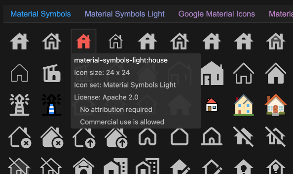
License is not shown when browsing an icon set, it is available above icons in icon set information.
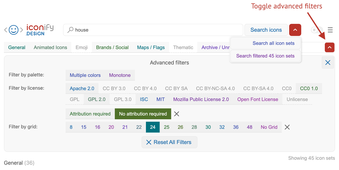
Advanced search
You can now filter icon sets by license, grid, palette.
If you filter icon sets, search has an option to search icons only in icon sets that are visible.
Better code samples
Code samples for icon have been improved.
You can now copy or download code samples for many formats and packages.
Iconify icon components
Old website showed samples for Iconify icon components, new website focuses on full components that you can add to your applications without extra dependencies.
While Iconify icon components are very convenient, they load icon data from API, which costs a lot of money to run, which currently GitHub sponsorships do not cover. Not even close. Therefore, it is better to encourage use of alternative solutions that do not rely on API.
Additionally, if you customise icon, such as change opacity or hardcoded color, Iconify icon components do not have code to do that on demand.
Code samples for Iconify icon components are also still available.
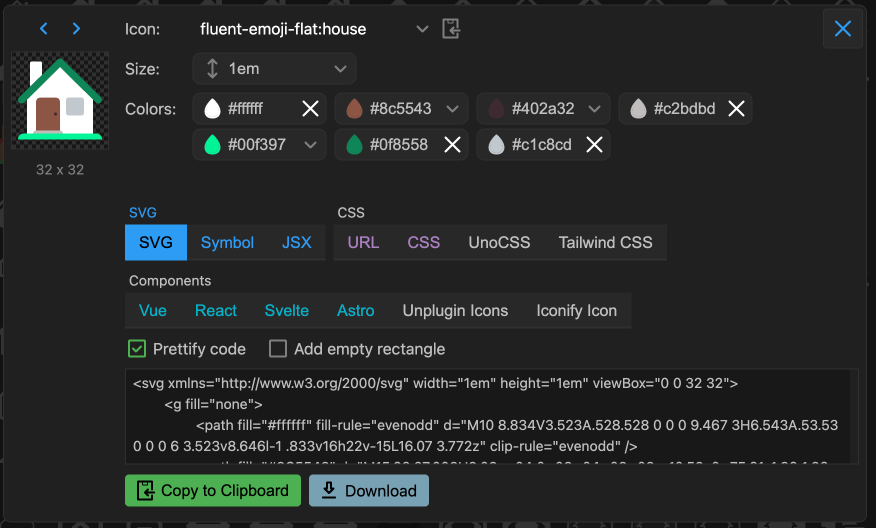
Customise colors and opacity
You can now have more options for customising icon code:
- You can change any color in any icon, not only currentColor.
- Opacity in icons that have transparent elements.
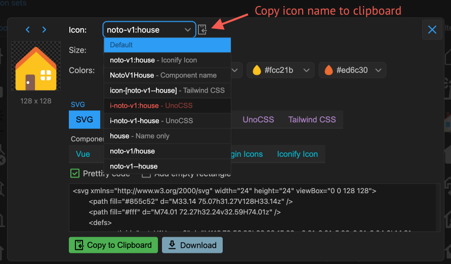
Copy icon name
If all you need is icon name to use in your project, for example, for Iconify icon component or for class name in UnoCSS or Tailwind CSS, you can now choose format of icon name.
Button to copy icon name to clipboard is next to icon name dropdown.
All changes are stored in browser storage, so you do not need to change settings more than once.
Designed for the future
The best part about the new rebuild is, new code is fully reusable.
This code base will be used to:
- Update Iconify plugin for Figma.
- Create new plugins for various design and development software.